About one month ago (January 2021), Abaqus Student Edition 2020 was released.
This new version not only includes novelties in the fields of interactions, enhanced compatibility of different finite elements, improvements in some constitutive models… But it also includes what will become a true revolution for Abaqus/Scripting users.
1. Updates in the Python environment
And here we go, Abaqus 2020 brings a series of updates for the Python interpreter on which Abaqus/Scripting runs. Although it is still Python 2.7, this new version includes three new libraries (or modules) that multiply the variety of actions that can be performed by means of scripting in Abaqus:
Matplotlib
With this library you can make all kind of graphics and plots in 2D and 3D (histograms, contoured plots, rastered images…). It is widely used for data visualization in scientific publications and all sort of reports.
Scipy
This scientific library is supported by numpy to carry out advanced mathematical operations, such as solving nonlinear equations.
Sympy
This library enables the use of symbolic Mathematics by employing analytical expressions, similar to other software like Mathematica.
2. What has actually changed?
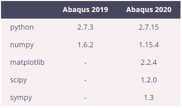
The table below sums up the main changes from Abaqus 2019 and Abaqus 2020 regarding Python libraries:
3. What else can we do now with Abaqus Scripting?
In this post we will not dive into the details of each of these three new libraries that Abaqus 2020 has to offer, but we can point out the brand new possibility of making high quality plots directly from scripts within Abaqus thanks to Matplotlib.
From now on, we will not only be able to export numerical results as plain text files, but we can produce curves and plots to visualize the results of hundreds of different simulations or obtaining figures that we can include later in our technical reports and projects.
That’s awesome! From now on, we can use Python scripts in Abaqus not only to work much more efficiently and speed up all the simulation workflow, as we have explained in other posts like this one, but we can also produce high quality figures and plots right from Abaqus!
4. Demo: Matplotlib in Abaqus
If we want to test how Matplotlib works in Abaqus 2020, we can just copy and paste the following few lines of code on the console inside Abaqus/CAE (command line interface). We can also copy these lines in a script (with extension .py) and run it from Abaqus/CAE (File > Run Script…).
- Python
					import matplotlib.pyplot as plt
import numpy as np

# Create a figure with one axes
fig, ax = plt.subplots()

# Generate 100 points evenly spaced between -5 and 5
x0 = np.linspace(-5., 5., 100)

# y = f(x), function to plot in the next line
y0 = np.exp(-x0**2)

# Plot x vs. y with black dots, label will be used in the legend
ax.plot(x0, y0, 'k.', label=r'$e^{-x^2}$')

# Label of the x axis
ax.set_xlabel(r'$x$')

# Label of the y axis
ax.set_ylabel(r'$y$')

# Display the legend, i.e. the label of the plotted line
ax.legend()

# Export the figure into a pdf file (vector quality)
fig.savefig('mylines.pdf')

# Display the figure on the screen, otherwise we will not see it
plt.show()
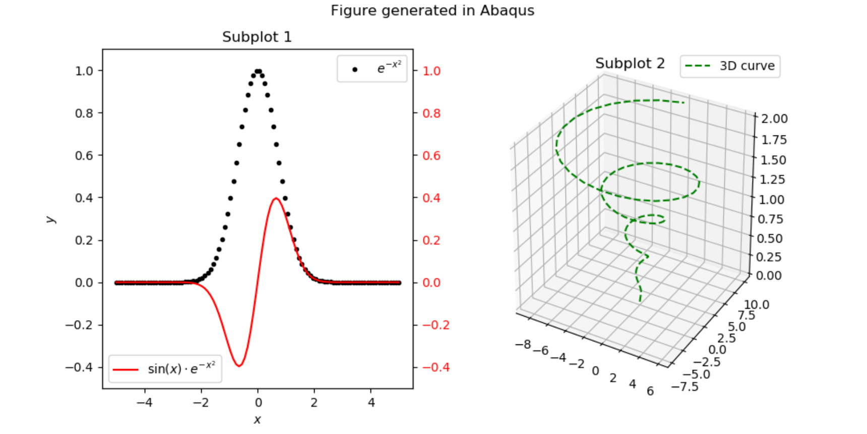
The previous example generates a plot with a single curve: \( y(x) = e^{-x^2},~ \forall x,~ -5 \leq x \leq 5\) with black dots. In addition, the figure is exported to a pdf file that we can visualize and use later.
You can download the script that produces the figure shown in the image below, with this link. Notice the equations shown in the legends of the left plot using Latex expressions.
The customization options are almost infinite in Matplotlib. If you want to see more examples of what you can do with Matplotlib, I recommend you to take a look at the gallery in the official website.
I hope that you find these tips useful!